ALEKSANDR VOINOV
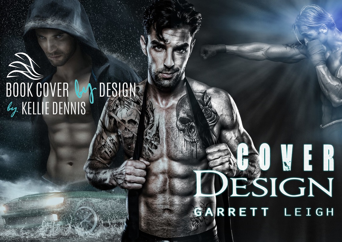
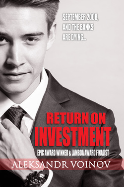
Garrett Leigh of Black Jazz Design did four covers for me, the latest of which was for my self-published novel Return on Investment. I was somewhat flakey on the brief—it was basically me flailing about how to get a little bit of understated sexiness (very understated) into the cover, and how to show the book is really about character growth, and, oh, it's a financial thriller with a gay protagonist, too.
Garrett came up with this version pretty much right away, somehow finding the perfect model and concept straight off the bat. Most of the work afterwards was focused on fine-tuning strap-lines, fonts and where they should be placed. Garrett went patiently through about 25 iterations on that, providing hand-holding and guidance throughout.
From the very first concept, I couldn't imagine Martin (my main character) looking any other way, and there was absolutely nothing of the usual “I have to get used to this cover” sense that I get very often for my other book covers. Garrett nailed it immediately.
Every time I’ve worked with Garrett, I found her quick, responsive, original and also a very good person to bounce ideas around with. She won’t just blindly follow the brief, but also disagree when you’re about to shoot yourself in the foot—every time we discussed something, we ended up with a cover I’m proud of and that encapsulates the mood and message of the book, while being visually compelling. Thank you, Garrett!